As a magazine, I find Vice to be too overbearingly "hip." I feel like it tries too hard to be gritty and in-your-face. However, the news content is pretty remarkable. Vice has a knack for finding stories you really wouldn't find in any other news forum, and for tackling subjects that are obscure but fascinating. Vice's online "channel" is home to mini-documentaries and interviews on topics and with people you've never heard of before, but are mesmerized with by the time you're done watching.
The following video is on Aokigahara Forest in Japan, the site of a startling number of suicides. It's an incredibly unconventional topic for a news-feature video, but it's humanizing and gives you a glimpse of a part of the world you might never otherwise have seen. It's a really tragic story, and it brings into stark light a subject that is usually ignored or not discussed.
The website wasn't allowing me to embed the video, so here's the link: http://www.vbs.tv/watch/vbs-news/aokigahara-suicide-forest-v3--2
Thursday, October 21, 2010
Wednesday, October 20, 2010
Monday, October 18, 2010
A 200-pound mess of a video
So this is an example of a bad video:
http://www.cnn.com/video/?/video/us/2010/09/30/sotvo.ia.huge.melons.kttc
First of all, there's no clear point to the video.
Yes it's a HUGE watermelon and that's cool, but why should we care? Does he plan to eat it with a hundred people, enter it at the county fair or hurl it at something? Is he trying to break a world record? There's no context in the video.
Then there's the technical aspects of the video. What of that awkward white noise while there's a closeup of the fruit? Also, there's sudden breaks in dialogue and therefore sound, all throughout the video. The quality itself of the video is also not good, the camera shakes too much. I thought the absence of noise was just on my computer but turns out, it's part of the video.
But the end is by far the worst characteristic of the video. It ends, just like that, in mid-sentence á la Sopranos series finale, which is very unprofessional.
After looking at the accompanying article, it's clear that this story was better fit for print and pictures rather than a video.
Sunday, October 17, 2010
Video
I looked for awhile, but I can't find the original source for this video. I stumbled across it on Youtube. The story told in the video is remarkable, but if the man was standing in a crowded street and interviewed I don't think it would have been nearly as touching. The different camera angles and portion of video where he plays his trumpet really highlight the video. Also, the director uses the rule of thirds throughout the clip.
Monday, October 11, 2010
Sunday, October 10, 2010
News Video: New York Times
New York Times News Video called "Taming the City of God"
-I really enjoyed this video because it had a great number and variety of interviews. I especially liked the interview with the man who's brother was killed by the police. It was really great reporting that they found him and then showed how he has come full circle to trust the modern day police.
-The story is well told giving the viewer background and history of former police violence in Rio De Janeiro. Then it gets into the full story, provides interviews to support it (along with matching broll) and leaves the viewer thinking with a question at the end of the story.
-I also think the broll is excellent! There is a wide variety of shots that capture the element of the story and supports what the interviewees are saying.
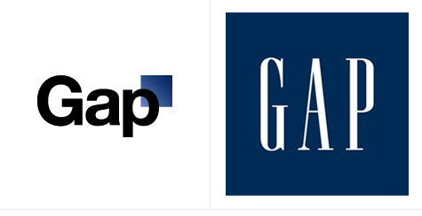
The Power of Design: Do you like Gap's new logo?
http://money.cnn.com/2010/10/08/news/companies/gap_logo/
Marka Hansen, president of Gap North America, defended the logo on The Huffington Post Thursday, writing in a blog post that the move brings Gap into the modern age.
"We want our customers to take notice of Gap and see what it stands for today," she said. "We chose this design as it's more contemporary and current. It honors our heritage through the blue box while still taking it forward."
Wednesday, October 6, 2010
News Page- GMAD
GMAD
I picked GoodMusicAllDay because I visit it every day for new music. The layout is clean and simple with a menu bar at the top that is easy to navigate. Also, once you scroll down you see the music which you can skip around on with the music player.
I like the website because it has free songs for download and a ton of mix tapes that come out every week.
News Page--NME
http://www.nme.com
This is the website of the NME (New Musical Express), a very popular British music magazine. They are known as a source for online music news and are very reputable.
It's one of my favorite websites, but because of the content more than the layout. Look at how many links, pictures and videos are on the main page. There's a lot of information, but an overwhelming amount of it.
Overall, I like the font choices and layout structure of the page, it just needs to have way less content on the homepage. It makes it cluttered and hard to find information.
Monday, October 4, 2010
News Page- AOL
www.aol.com
Although this is pretty old school, I still tend to use this newspage to get random news facts. I check other websites on a daily basis like the NYT to get the majority of news, but since I still use AOL mail, I always tend to scroll down this newspage and read what's going on.
I like it because it's very simple. It has a tab for top news, business news, entertainment news and sports news. The website as a whole looks very appealing and organized to me. There's also an area at the bottom right that lets you choose which city you would like to hear local news from.
Sunday, October 3, 2010
News Page - The New York Times
http://www.nytimes.com/
I really enjoy The New York Times' web page because the layout, in my mind, is similar to that of a traditional newspaper. There's the headline banner with the date as well as the included advertising. One doesn't have to scroll to the left or right when they open they page, however, one does have to scroll down quite a ways. The tool bar is rather large, but I think the use of bold and grey type makes it more easy to follow visually. The page is also broken up into sections, so that once one becomes accustomed to the page, they can instantly scroll to their favorite "section." Additionally, there are a lot of pictures included, but they don't overwhelm the page.
I think my favorite part about the page is that one can read the headline and the initial sentence which sums up the story for you. In an age where time is of the essence, it helps those who are on the go get a lot of news in a shorter period of time.
The New York Times also has an email version of their web page which I take advantage of as well.
News Page- The Washington Post
The Washington Post online has its news content aligned to left of the page. Advertisements are closely placed to the news content on the right. There is blank, white space next the advertisements taking up the rest of the area remaining on the right of the page.
The entire placement is poorly done. I think the news content should be in the center of the page while the advertisements are placed on either side. The Dallas Morning News is a good example of a better design.
News Page BBC News
www.bbc.co.uk/news
This is a good source for world news. I think there are a lot of positive aspects to this site.
Positive:
- I like the red and blue color scheme, and that the page is still very clear.
- The menu is at the top of the page, and you can browse by country or type of news.
- I think there is a good balance of graphics and text; the layout is easy to look at.
- It doesn't have a lot of movement, which I like because it's not too distracting.
- Most of all, this site is very easy to use.
There is one thing I don't like about this site.
Negative:
- The gray type is a little weird; it's kind of hard to read. Black would be better.
News Page - San Diego Union-Tribune
http://www.signonsandiego.com/
Overall, the home page of the San Diego Union-Tribune is not designed well, although it does possess some good qualities. For someone who is arriving at the page from a link, it's hard to know exactly what the page is. I think the biggest mistake on the page is that the actual title of the news organization is one of the smallest pieces of text. The title should be instantly noticeable, especially since the URL is signonsandiego instead of sandiegouniontribune, or something like that. It would be more recognizable to do it this way.
I think that the drop-down boxes for navigation are pretty bad too. The links to inside pages are tiny, difficult to read, and also white against dark blue, which is not ideal.
One of the things that I liked about the page is that there were several interesting, large pictures which made it less boring. However, I would have preferred that the links to top headlines and most popular, etc. were on the right instead of the left, giving more attention to the stories that are on the main page.
When you first navigate to the page, what you see in the browser is not particularly interesting, so I would have probably put one of the interesting pictures "above the fold" instead of a bunch of text and headlines.
Subscribe to:
Comments (Atom)